The Frogman

text

sirfrogsworth:

image

Ummmm…

Sooooo…

I think Amaury Guichon is the world’s most talented chocolate sculptor.

And almost everything he creates is a stunning work of art.

And while this is technically impressive…

This cursed-ass lion needs to go into the blender.

Just to give Amaury a redemption arc, this flamingo pool floatie is next level.

image

The detail is incredible—including a valve and little wrinkles at the seams.

image

My first question whenever I see these chocolate creations is “what happens next?”

My upbringing always makes me feel immediate guilt at the thought of wasted food. But art always requires the use of some natural resource, and I think the world’s supply of chocolate is not in jeopardy because some dude is making inedible sculptures.

But apparently whatever isn’t meant to be consumed is displayed at his temperature controlled school and these items can be preserved for quite some time.

Though if the power goes out and that lion melts I would be okay with that.

[ Amaury Guichon ]

19 hours ago

May 4, 2024
CommentsComments (View)  
text

knight-intraining:

Hey,

I don’t talk a ton about my job, but I teach high school theatre and coordinate the afterschool program.

We are doing a popcorn fundraiser: you buy it online, it ships right to you, and we get half the profits. All funds we receive go straight to putting on productions - just the rights to put on a show are incredibly expensive. We are a title 1 school, which means our budget isn’t great to begin with, and that our community doesn’t have a ton of disposable income to support us. These kids need theater, especially in our world today - it is a priceless coping skill for them.

I know times are tough for all of us and arguably money should be spent on better causes. But if you could at least share - so it reaches someone who can give, me and my kids would be forever grateful! Sharing on other platforms is also great!

Thanks in advance for any support you can provide!


Hello everyone.

I have a favor to ask.

Would you buy some popcorn?

Gwen recently contacted me and informed me she lived nearby and asked if there was anything she could do to help me.

And I was like, “Well, my house still has about 10 metric tons of my mom’s antiques and I do not have the energy to sort through it all. Would you mind helping me with that?’

And Gwen was like, "Sure!”

We just cleared out 1.5 rooms of stuff today. Gwen was able to accomplish more in a few hours than I have in the last 4 months.

My body has been fighting me constantly due to stress. I am trying to save my home and figure out my dad’s estate and pulling my hair out trying to work with Social Security and sorting out the house has just not been within my capabilities.

So finding Gwen has kind of been the only thing I have going for me lately.

Gwen has refused any compensation. She will not even accept gas money. But she teaches some theater kids and they need some help to do that theater thing. And as a former theater nerd I’d love to help them out.

So…

Gwen is helping me.

She is trying to help her students.

And I could use your help to help Gwen help her students.

Did that make sense?

Basically… buy popcorn… help theater kids put on a show.

Sound good?

Plus, look at all these flavors!

image
image
image
image

Here is the link again in case you don’t want to scroll up.

2 days ago

May 2, 2024
CommentsComments (View)  
text

sirfrogsworth:

Photo Restoration: Adventures in Upscaling - Part 1

After finishing my big photo restoration for Katrina’s family I was organizing my files and noticed a scan I missed.

image

The scan was fairly low resolution and the photos were only 400x700 pixels.

But I was bored and restoring photos helps me relax, so I decided to fix them up anyway—even if they did not have great fidelity.

I did my thing, and it worked pretty well.

image
image

But I have been interested in a set of photo tools made by Topaz Labs. They are known for their noise removal and upscaling apps and are praised by many photographers I follow.

Before I jumped into this A.I. suite of tools I wanted to make sure it was trained ethically with licensed images—same as how Adobe operates.

image

So that made me feel better about that aspect. Plus I feel this is exactly the kind of thing A.I. is great for. A tool to help artists rather than displace them.

I have used a few upscalers in the past and have had varying degrees of success. Typically they just implore various sharpening tools and try to control the chunky artifacts with denoising tools—trying to find the best balance between the two.

Two opposites trying to reach a compromise.

But I was not expecting the results I got. This is way beyond anything I have ever tried before and I had no idea the technology had improved this much.

Here are the results…

All photos will be displayed in order of original, my edit, Topaz upscale followed by extremely zoomed in crops to help you better see the effects.

image
image
image

Crops…

image
image
image

Topaz has a specific “face recovery” algorithm and I was curious if these results were only because of that.

But then I looked at this little guy and he seemed pretty sharp as well.

image
image

I was stunned at how well this was working. I was able to upscale these photos so they could be printed as an 8x10 with 300ppi resolution.

Maybe that first photo was just a fluke, so I proceeded with the others.

image
image
image

Santa’s face was mostly obscured, but it was still able to work its magic despite that.

Crops…

image
image
image

At this point I felt like I was a caveman discovering fire for the first time.

This next photo is interesting because it has a very creepy clown clearly plotting to kill baby Katrina. And the clown has on full makeup, which could confuse the face recovery.

image
image
image

Crops…

image
image
image

The clown face looked great, but there were two interesting artifacts involving text.

First, there was not nearly enough information on the clown’s button. So the A.I. did its thing and rendered nonsense. I found a smiley face button and just did some classic compositing.

image
image

There was also a bottle of Elmer’s glue on the table and even though I felt there was enough detail to make out the words, the A.I. still struggled. So I found a bottle of vintage glue with the same label and replaced it.

image
image
image

And it kinda feels nice that A.I. can’t do everything yet and I still have to use my problem solving skills to make the best photo possible.

On to part 2!

I’m thinking of starting a photo restoration service and this could be a huge help.

I am really amazed by these results. Be sure to pinch and zoom if you are on a phone.

6 days ago

April 29, 2024
CommentsComments (View)  
text

sirfrogsworth:

bending-sickle:

sirfrogsworth:

image
image
image

I tried to find more information about Albert here. There is an article in The Mirror, but some of the reporting seems dubious. Which I believe is standard operating procedure for that particular news outlet.

But according to the article, “Fat Albert” lives in the very specific area of “Alaska, USA” and is believed to be the fattest polar bear in the world. And they claim he got fat because the townspeople of “Alaska, USA” are following an ancient tradition that dates back “thousands of years.”

The locals throw out large amounts of whale blubber to the bears as a sign of ‘respect’. They would cut a large portion of the whale and blubber, and drag it four miles out of town for the bears to find. This stops the bears from travelling into town to harvest and disrupting the process. In other words, it’s a way to stop a group of hungry bears coming towards you in a hurry.

From supplemental research there is precedent for folks in Russia and Alaska to leave whale carcasses for polar bears, but I could not find any corroborating evidence about Albert specifically.

So, I rate this myth…

image

In any case, when I saw this picture of Albert, it seemed like a good opportunity to practice my Photoshop skills. He has clearly been rolling around in some mud and his beautiful white coat has been obscured.

image

It is very easy to change the color of something to red, blue, or green and every color in between. Just hit that hue/saturation and check colorize and you’ve got Pride Albert in a jiffy.

image

However, it is much more challenging to change things to white or black. This is the bane of graphic designers who have to take the same picture of a t-shirt and digitally alter it to be every available color including black and white.

So I challenged myself to give Fat Albert a bath.

image

And then I challenged myself again to make him a distant relative.

image

I wish I could tell you the exact process for how to do this, but this is one of those things you have to trial and error your way through and I honestly don’t remember everything I did.

One thing I can tell you is that I definitely, absolutely, positively named all my layers properly—as that is best practice and I am a good Photoshop boy.

image

This Reddit post says Fat Albert lives near the village of Katovik and says he weight 1000 lbs.

This Facebook page has more photos from the above set.

This Facebook page confirms the village, the practice of leaving blubber outside of town so bears don’t disrupt the whaling harvest, and says he weight 679 kg (vs the usual 450 kg) and credits the photos to Ed Boudreau.

I feel like I’m pretty good at research but sometimes you folks outdo my Google Fu and it is impressive.

Thank you for finding all of this wonderful info.

I do think I was right to be skeptical. The “thousands of years” seemed difficult to verify from an archeological perspective. But your links say it is only “hundreds of years” which sounds much more likely. And it’s nice to be able to narrow it down to a city rather than a 660,000 square mile landmass.

Also, here is a bonus Pride Albert.

image

I’m bored and for some reason I decided to Photoshop a fat gay polar bear.

As one does.

6 days ago

April 28, 2024
CommentsComments (View)  
text

sirfrogsworth:

Let’s talk about vintage lenses.

Here is your cool samurai show with modern lenses.

image

Here is your cool samurai show with vintage lenses.

image

Hollywood is no stranger to fads.

We are currently in the middle of a “make everything too dark” fad. But that fad is starting to overlap with “let’s use really old lenses on ridiculously high resolution cameras.”

This is Zack Snyder with a Red Monstro 8K camera.

image

He is using a “rehoused” vintage 50mm f/0.95 Canon “Dream Lens” which was first manufactured in 1961.

image

This old lens is put inside a fancy new body that can fit onto modern cameras.

image

Which means Zack is getting nowhere near 8K worth of detail. These lenses are not even close to being sharp. Which is fine. I think the obsession with detail can get a bit silly and sometimes things can be “too sharp.”

But it is a funny juxtaposition.

The dream lens is a cool lens. It has character. It has certain aberrations and defects that can actually be beneficial to making a cool photograph. It’s a bit like vinyl records for photography.

image

[ Peter Thoeny ]

It has vignetting and distortion and a very strange swirly background blur.

image

[ Gabriel Binder ]

Optical engineers have been spending the last 60 years trying to eliminate these defects. And I sometimes wonder if they are confused by this fad.

“I WORKED 70 HOURS PER WEEK TO GET PERFECT CORNER SHARPNESS!”

And whether you prefer to work with a perfect optic or a vintage one… it is a valid aesthetic decision either way. I think vintage glass can really suit candid natural light photography. You can almost get abstract with these lenses.

image

[ Peter Theony ]

Personally I like to start with as close to perfect as possible and then add the character in later. That way I can dial in the effect and tweak how much of it I want. But even with modern image editing tools, some of these aberrations are difficult to recreate authentically.

That said, it can be very easy for the “character” of these lenses to become distracting. And just like when someone first finds the lens flares in Photoshop, it can be easy for people to overdo things.

image

Zack Snyder decided to be his own cameraman and used only vintage glass in his recent movies and it has led to some complaints about the imagery.

I mean, Zack Snyder overdoing something? I can’t even imagine it.

Non camera people felt Army of the Dead was blurry and a bit weird but they couldn’t quite explain why it felt that way.

The dream lens has a very wide aperture and it lets in a lot of light. But it also has a very very shallow depth of field. Which means it is very difficult to nail focus.

image

[ Peter Thoeny ]

Her near eye is in focus and her far eye is soft. You literally can’t get an entire face in focus.

There is no reason you have to use the dream lens at f/0.95 at all times. But just like those irresistible lens flares, Zack couldn’t help himself.

Here is a blueprint that you can’t really see.

image

Extreme close ups of faces without autofocus at f/0.95 is nearly impossible to pull critical focus on.

image

Looks like Zack nailed the area just above the eyebrow here.

Let’s try to find the point of focus in this one.

image

Ummmm… she is just… blurry. Missed focus completely.

But Zack isn’t the only one going vintage. I’ve been seeing this a lot recently.

Shogun is a beautiful show. And for the most part, I really enjoyed the cinematography. But they went the vintage lens route and it kept going from gorgeous to “I can’t not see it” distracting. And perhaps because I am familiar with these lens defects I am more prone to noticing. But I do think it hurt the imagery in a few spots.

Vingetting is a darkening of the corners of the frame.

image

Light rays in the corners are much harder to control. A lot of modern lenses still have this problem, but they create software corrections to eliminate the issue. Some cameras do it automatically as you are recording the image.

Vintage lenses were built before lens corrections where a thing—before software was a thing. So you either have to live with them, try to remove them with VFX, or crop into your image and lose some resolution.

It’s possible this is the aesthetic they wanted. They felt the vignetting added something to the image. But I just found my eyes darting to the corners and not focusing on the composition.

And then you have distortion.

image

In this case, barrel distortion.

This is mostly prominent in wide angle lenses. In order to get that wider field of view the lens has to accept light from some very steep angles. And that can be quite difficult to correct. So you kind have to sacrifice any straight lines.

image

And sometimes this was a positive contribution to the image.

image

I thought the curved lines matched the way they were sitting here.

But most of the time I just felt like I was looking at feudal Japan through a fish’s eye.

image
image
image
image

It’s a bit more tolerable as a still, but when all of these verticals are bowing in motion, I start to feel like I am developing tunnel vision.

I love that this is a tool that is available. Rehousing lenses is a really neat process and I’m glad this old glass is getting new life.

This documentary shows how lens rehousing is done and is quite fascinating if you are in to that sort of thing.

But I think we are in a “too much of a good thing” phase when it comes to these lenses. I think a balance between old and new can be found.

And I also think maybe Zack should see what f/2.8 looks like. He might like having more than an eyebrow in focus.

I think it is pretty clear that Zack Snyder is trying to summon his inner Stanley Kubrick while using the Dream Lens.

Kubrick wanted to film Barry Lyndon with all natural light. But due to being a period piece, some scenes needed to be filmed using nothing but candlelight.

image
image
image

There was not any film sensitive enough to pull this off, at least not without horrible amounts of grain, so Kubrick used a famous Zeiss optic developed for NASA to photograph the dark side of the moon.

image

The Zeiss Planar 50mm f/0.7 lens was one of the brightest lenses ever made and could suck in light like a vacuum. One recently sold at auction for $146,000. When used at the f/0.7 aperture, the depth of field became razor thin. Actors had to learn and rehearse ultra precise blocking. If they didn’t hit their mark by even an inch or two, they would be out of focus. I’m sure this required many many takes and was probably a frustrating experience.

Kubrick was a bit more of a perfectionist and probably wasn’t satisfied nailing focus on an eyebrow. But he got his candlelit scenes and they did look stunning.

Kubrick used this lens because he was trying to solve a problem. He didn’t open the aperture that wide without good reason. I just wish the use of the Dream Lens was a bit more intentioned than “look how blurry the background is!” like a beginner photographer getting their first nifty fifty.

CommentsComments (View)  
text

thefrogman:

sirfrogsworth:

Photographers all know about polarizing filters. They remove reflections off the surfaces of objects. We use them to see into water or windows that are obscured by those reflections. But anything with an even slightly glossy surface has a layer of reflection on top. So if you have a shiny green plant, it can remove the shiny and reveal a very saturated green underneath. Polarizers also remove a lot of scattered and reflected light from the sky. Which reveals a deep blue color you didn’t even know was there.

Here is a photo I took of my circular polarizer.

image

And the first thing I noticed when walking outside during the eclipse was the color of everything was more saturated, just like in that circle. Apparently, an eclipse significantly reduces polarized light and I got this creepy feeling because I was only ever used to seeing the world like that through the viewfinder of my camera.

The other thing I noticed was my outdoor lights. I leave them on all the time because I never remember to turn them on at night. And usually the sun will render them barely visible during the day. On a very sunny day they almost look like they are off.

image

But you can clearly see they are shining and even flaring the camera during the eclipse.

Our eyes adjust to lighting changes very well so it was hard to tell how much dimmer things were, but that is a good indication. I took this photo a few minutes ago and you can see how dim the lights appear after the moon has fucked off.

image

I did a calculation using the exposure settings between these two photos. The non-eclipse photo has 7 f-stops more light. That is 128 times or 12,700% more light.

A partial Pringle eclipse cut the sun’s light by 99.2% and somehow our eyes adjusted to make it seem like a normal sunny day (with weird ass saturated colors).

Additional Observations

So, I woke up about 4 minutes before the eclipse. I was very unprepared to photograph it in the normal quality you’d expect from a photographer. However, I did capture some interesting details that I thought I’d share beyond the lack of polarized light.

First up… the shadows.

image
image
image

The shadows were very sharp. In photography there is this concept of light going from a spectrum of hard to soft. Hard light has very high contrast and sharp shadows. Soft light is more flattering and diffused with softer shadows.

image

To get hard light and sharp shadows you need a small “point” light source. A point light can either be very small or it can be very far away or a combination thereof.

In the studio you could use a bare bulb flash to get a point source.

image

Or you can attach a modifier like a softbox to create a large light source. The bigger, the softer.

image

The sun is massive, but it is also super duper far away. So it ends up being the smallest point light source available. However, the atmosphere can scatter and diffuse that light, essentially “enlarging” the light source.

To get perfect hard light shadows you need to go to… the moon.

image

But the eclipse blocked out about 99% of the sun and it reduced the amount of scattered light. And it greatly reduced the size of the light source causing some very defined sharp shadows.

image

But not *all* of the shadow was sharp. My left shoulder is very defined but my right shoulder is a bit fuzzy.

You can see it on my fingers too.

image

Sharp on one side, soft on the other.

This is essentially because the sun has been split into two different light sources in two different directions.

In one direction you have a larger light source causing softer shadows.

image

And in the other direction you have a smaller light source causing sharper shadows.

image

In photography we have these strip softboxes that we usually place behind a subject to create an edge light.

image
image

Only a narrow, small band of light is hitting the body. If we were to use a strip box to light a face, it would be a small light source creating sharp shadows.

image

But one trick we can do is to turn the strip light horizontal.

image

Now the light source hitting the face is large as it wraps around the head.

image

So a long and narrow light source is essentially large and small simultaneously. And depending on the direction the light is coming from it is either hard or soft light.

Destin from Smarter Every Day explained this phenomenon briefly in his eclipse video.

I also think this large and small light source phenomenon affected my lens flares when I photographed the sun.

In this photo it literally looks like I’m getting starburst flares from two light sources.

image

And in this photo the flares have a sharp bright edge as well as a dimmer more diffused area.

image

Normally these starburst flares (caused by light leaking through the metal aperture blades in the lens) have more homogenous tines without that feathering effect.

image

And then I noticed a different kind of flare in my photos—with all the colors of the rainbow.

image

And each band of color matched the crescent shape of my partial eclipse.

image
image
image
image
image
image
image
image
image

Like a camera obscura, these flares were in reverse orientation to the crescent sun. And while I wasn’t able to get the sun in sharp focus, the purple section of the flare is very defined. I think that represents approximately how much of the sun was covered by the moon at my location—about 130 miles from totality.

I am a student of light. That is essentially what photography is. And I found this to be a fascinating lesson on how bonkers light can be. I was a little bummed I couldn’t road trip to southern Missouri to see totality, but I am grateful to still have a cool eclipse experience.

I wanted to add some quick corrections to this post.

In trying to understand this phenomenon better and also discussing it with another person on tumblr (check notes if you want to read the discussion) I thought it best to clarify a few things for the sake of accuracy.

First, I probably should have said the light during an eclipse is significantly *differently* polarized.

And while that change in polarization is responsible for the sky being much more saturated, the ground colors being more saturated turns out to be more of a coincidence.

Even though the greens look exactly the same as through a circular polarizer on a normal sunny day as they did during the eclipse, they are more saturated due to our eyes seeing things that way in dim environments.

So the sky was more purple-blue due to the change in light polarization.

And the decrease in overall luminance caused the change in saturation on the ground.

I also said starbursts are caused by light “leaking” through aperture blades in the lens and I should have said “bending around.”

For the vast majority of camera lenses, when the aperture gets smaller it does not create a perfect circle. There are little corners where light can diffract around and cause the pointy spikes. Lenses with an odd number of aperture blades will give twice as many spikes as the number of said blades.

The second and third examples below are typical apertures in modern lenses.

image

I do try to be as accurate as possible and I did double and triple check a lot of the information in this post, but I guess I missed those things.

My apologies.

Thanks to @misanthropic-mollusc and @tedkaczynskiofficial to spotting these errors.

1 week ago

April 23, 2024
CommentsComments (View)  
text

sirfrogsworth:

image
image

Now these are the neighborhood updates I was hoping for.

Finally this app is paying off.

We haven’t had this much excitement in our area since the Mad Pooper of 2013.

I think I will dub this dubious defecator The Duece Dropper.

I have summited the top of the alliteration mountain. This is my masterpiece. It’s all downhill from here.

2 weeks ago

April 21, 2024
CommentsComments (View)  
text

The Vanish

sirfrogsworth:

There is a trope in movies where a character disappears after a vehicle, object, or people move in front of them. It’s a cool move. Very ninja-like. 

image

Unfortunately, I think my brain has ruined all of those scenes for me. 

A while back I was watching this trope unfold in a movie and my brain was like, “I wonder what that would have looked like from behind.” 

My imagination spooled up and the only possibility was that the character do a goofy sprint alongside a bus. 

Turns out, any of these scenes would look ridiculous from the other direction. And now almost as a reflex, my brain imagines the reverse angle every time it happens and I can’t help but giggle.   

It’s been several years since I made this post. I don’t even remember making it and had no idea how popular it became.

And after all this time, I’m still imagining the other side…

image
image
image
image

2 weeks ago

April 20, 2024
CommentsComments (View)  
text

sirfrogsworth:

sirfrogsworth:

sirfrogsworth:

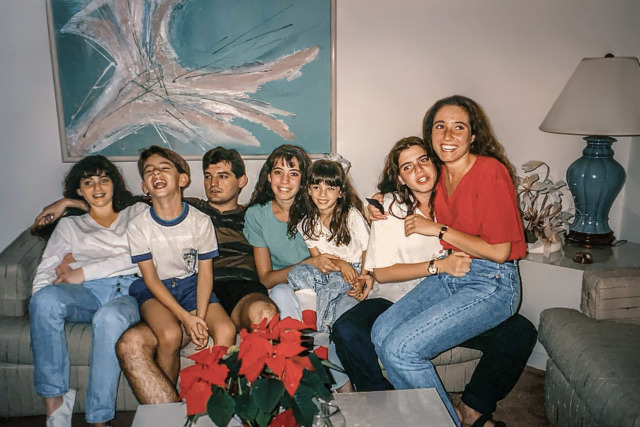
Photo Restoration Project - Part 1

A long time ago, Katrina sent me some old photos of her family I could restore. Her parents have been helping me from afar for years and I really wanted to do something nice for them. Unfortunately my dad got much worse and I pretty much forgot about this project for quite some time.

But then I decided to visit Katrina in Orlando and we discussed having dinner with her parents and I remembered these photos. So I thought I would fix them up so I could present them as a gift in person.

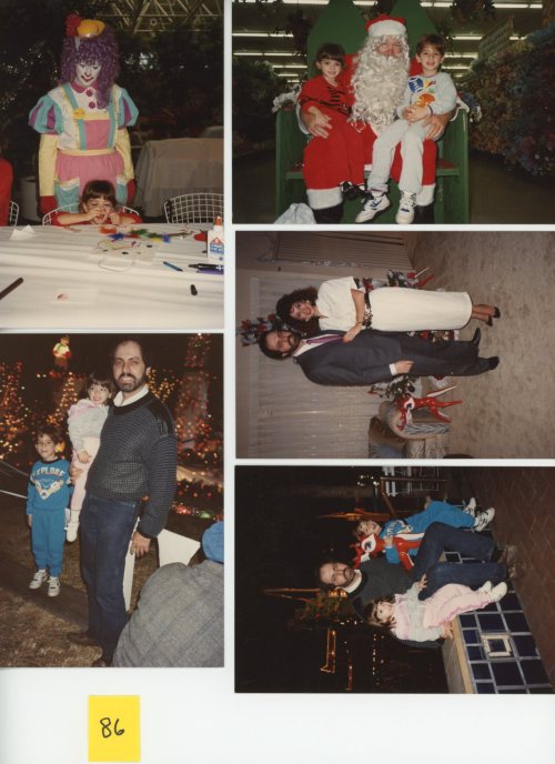
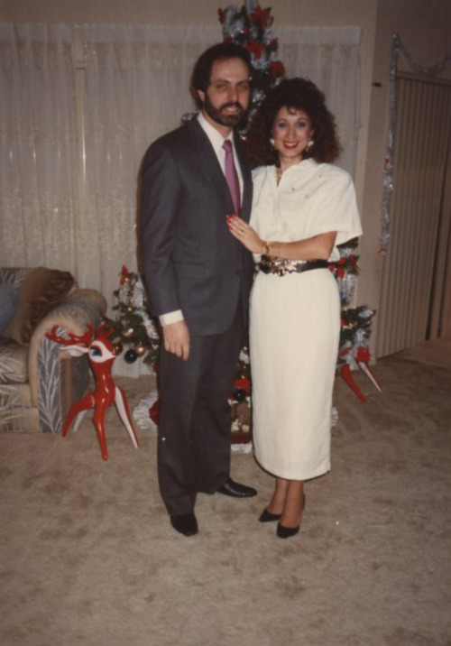
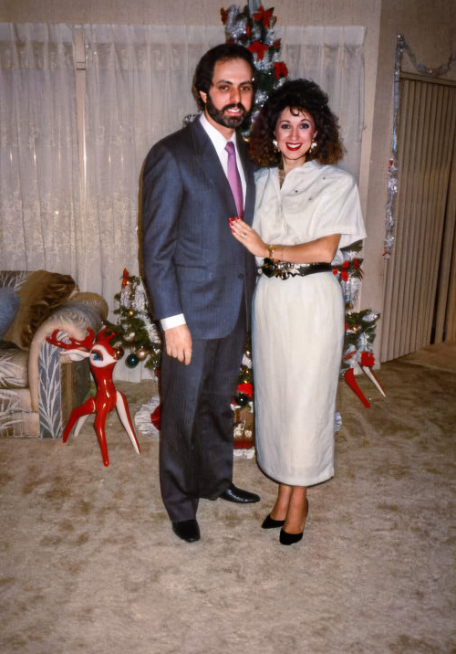
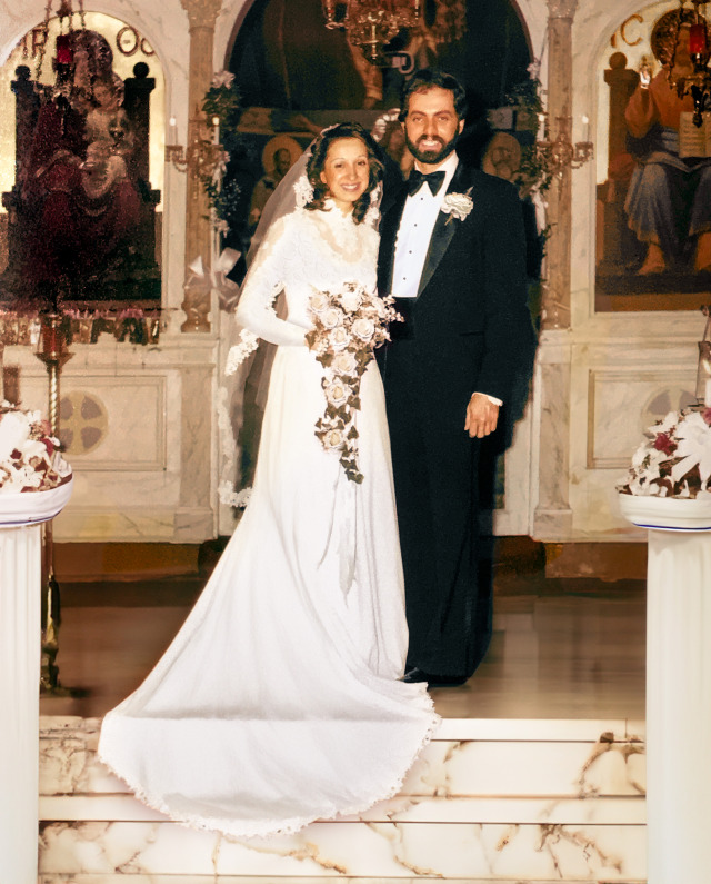
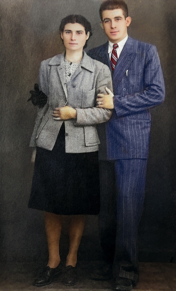
The first and most important photo was from her parents wedding.

image

Old photo prints can fade over time due to UV light exposure. From what I understand, different colors fade at different rates and red/orange tones tend to be the least susceptible to this fading. Thankfully all of the color information is still there, it’s just that the darks are not as dark and the lights are not as light. The dynamic range got squeezed like an accordion. However, if you do a levels adjustment on the red, blue, and green channels individually, you can unsqueeze the accordion and balance everything back to the way it was.

image

But you can’t always save everything and there may be other damage that needs fixing. If something becomes pure white, there is no way to restore that detail. Thankfully I was able to use the new generative fill feature to bring back detail in the dress, the flowers, and the tuxedo shirt.

And because I hate front facing flash and how it makes colors look ugly and sterile, I may have also added a marble floor and pillars.

image

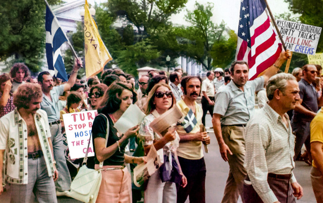
Next up was a photo of Anastasia, Katrina’s mom, protesting Henry Kissinger on behalf of her home country of Greece. This suffered from the same color fading issues.

image

What made this one a little more tricky was an uneven fading. The left side had to be adjusted independently and the top was even more faded. I had to isolate the trees to bring back their color. And the protest signs were difficult to read, so I enhanced those as well.

image

Next we have this lovely photo of Anastasia tending to some house plants.

image

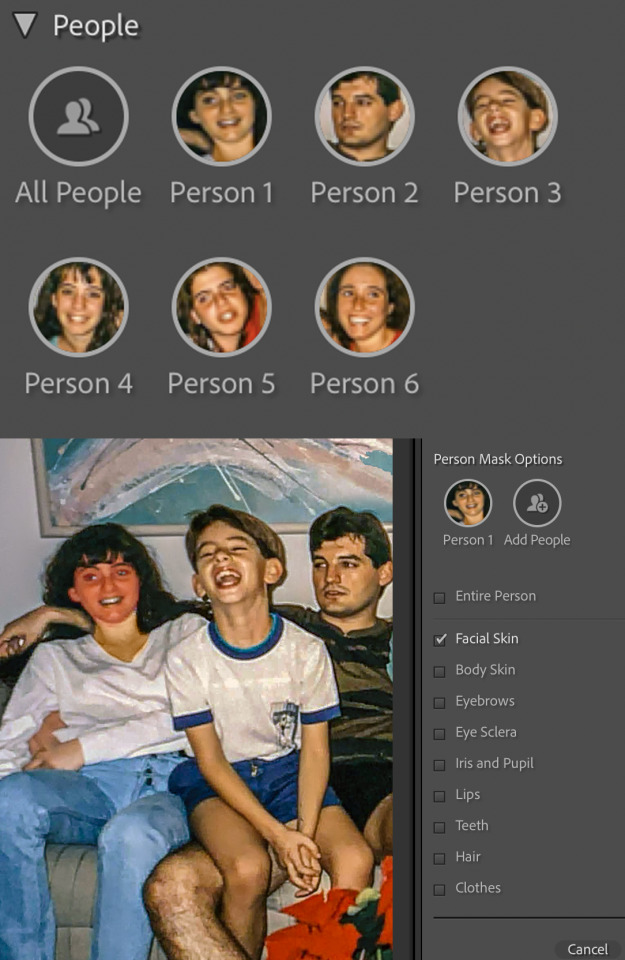
This photo was actually in decent shape. It lost a little contrast, had a little bit of fading, and her top retained almost no detail I could recover. Recovering accurate skin tones is probably one of the most important skills I learned when restoring these photos. I wanted to keep that filmic look of the era while avoiding making people look jaundiced or pale. Lightroom’s new masking feature that let’s you isolate every aspect of the people it detects in a photo. This made fixing skin tones much easier. I could isolate just her face or her lips or her hair or her eyes and make precise individual adjustments. This process could have taken a great deal longer without this feature. But, I brought back proper contrast and color, added a little bit of detail to her top with gen fill, and hopefully got fairly accurate skin tones as well.

image

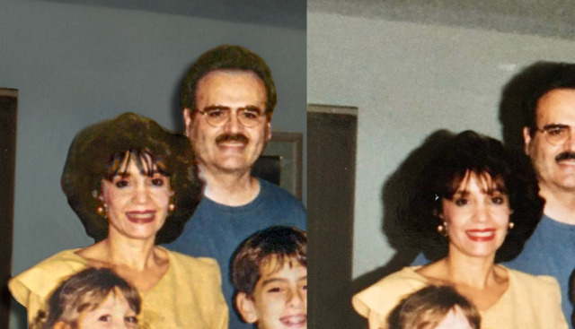
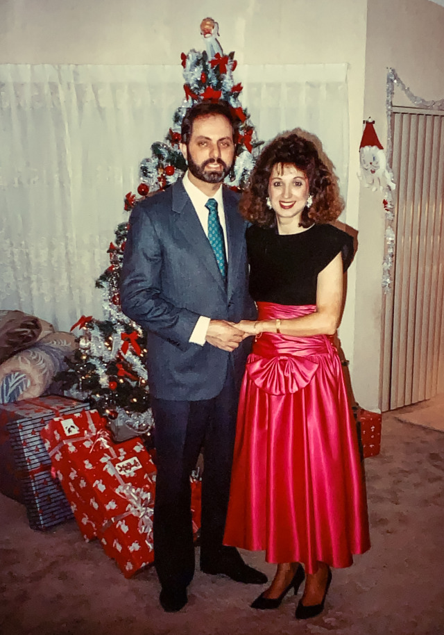
Next up, forward facing flash strikes again in a photo of Mike and Anastasia during Christmas.

image

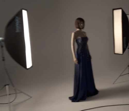
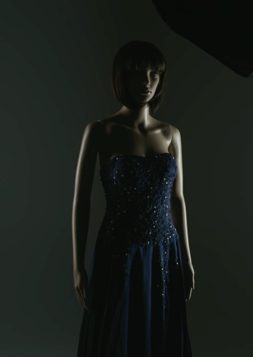
Film did not do well in low light. If it was indoors and nighttime, you pretty much had no choice but to use flash. But a flash is a very small, bright light source and this causes a very unflattering result on humans. Today we have much more powerful flashes with rotating heads. We can bounce the light into the ceiling or off a wall and increase the size of the light source to get a more flattering result.

In this photo I wasn’t able to do much, so I just balanced the skin tones and brought out some hidden detail and called it a day. It’s still a lovely memory and thankfully film has such character that it negates a lot of the unflattering aspects of direct flash.

image

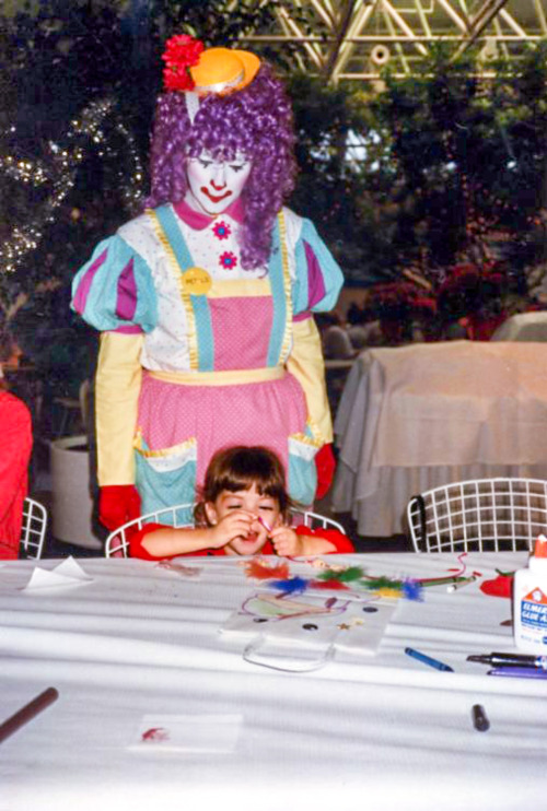
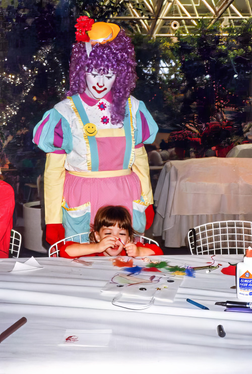
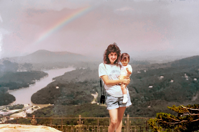
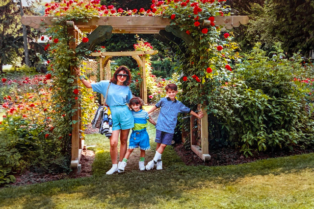
Next up is some cuteness…

image

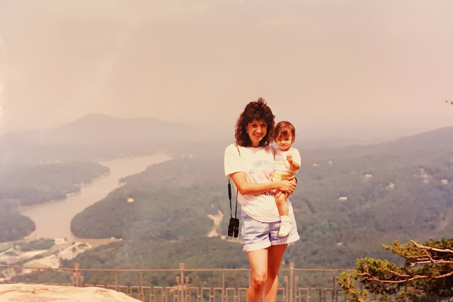
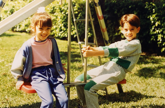
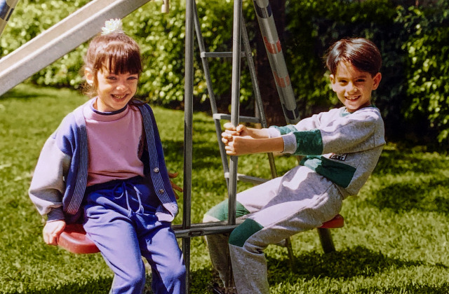
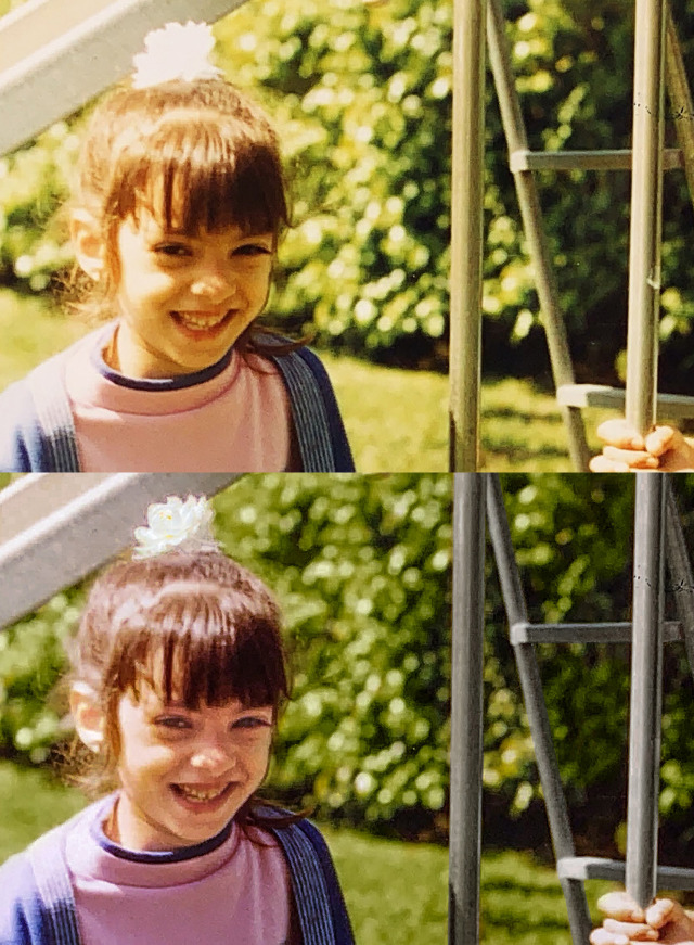
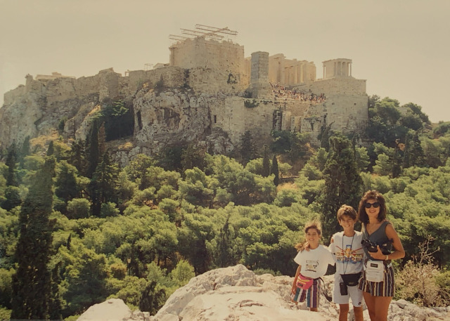
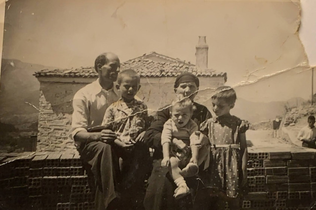
A big priority when editing photos is to make sure the subjects are the star of the photo. And in this one their faces were a bit obscured in shadow. There was also a lot of haze in the background hiding the beautiful vista. Not to mention when I cleared that haze, there was this super faint hint of something in the sky. I can’t tell if it was a rainbow, but I decided to believe it was a rainbow. The only thing that I am still struggling with, and this seems to be common with a lot of old photos, is green. Getting a good, saturated, natural green to look right has been very difficult. Everything I try ends up looking toxic or fake. The only thing that ends up looking right with the rest of the photo is more of a yellow-y brown. It’s something I’ll have to work on as I learn, but as long as the overall photo looks balanced and natural, I’m okay with not perfectly nailing the greens.

image

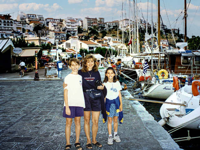
Up next we have a lovely scene on a Greek dock…

image

As far as editing goes, this was pretty basic. I just undid the fading, adjusted the skin tones, replaced the blown-out sky, and made the colors pop. But I think this is actually one of my favorite before and after shots. I just love how such a simple fix brought this scene to life.

image

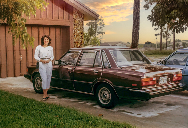
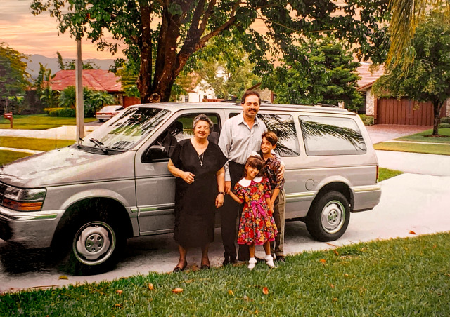
A new car is a big deal and Anastasia looks so proud here…

image

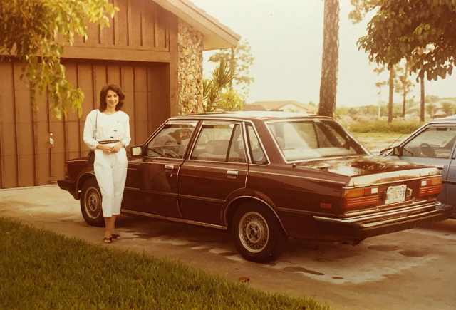
This image has another common issue in addition to the typical fading of colors. It has a yellowish orange color cast. This could have been an issue with the film used or the development process or a chemical reaction on the print. A color cast is a lot like looking through colored glasses. It’s like a translucent color material was put on top of the image. This can be a little trickier to deal with, but if you know your color theory, you might already know the solution. Blue is the opposite of yellow/orange on the color wheel, so if you introduce blue to the image it should balance out. Also, add a sky if it was missing.

image

Next up we have a landscaping project…

image

This one wasn’t too tricky, but there was one interesting issue I had to address. All light has a color temperature. Daylight has a temperature of around 5500K. But the inside of the garage was being lit by reflected light and so that light took on the color temperature of the things it was bouncing off of. So I had to mask out the people and the car and address the color temperature inside the garage to make everything look balanced. Also, the green fought me hard on this one. And with the theme of this picture being plants, I felt I really needed to find a tone that worked. I think I finally got there, but I spent way too much time in the color picker doing trial and error of green tones. Also, new sky.

image

With this next one I actually did a pretty thorough explanation of how I edited it. But this was probably my favorite puzzle to solve from this collection of photos.

I’ll do the abridged explanation…

image

The physical photograph was printed on a paper with a very heavy texture. And when it was scanned, the light from the scanner bounced off that texture and created a pattern of unwanted highlights.

image

I was worried this was impossible to fix and I almost gave up on this photo. But after one final Google search I discovered something called “Fast Fourier Transform.” It’s a mathematical formula that can be used to detect patterns. And the image editing software Affinity Photo, just so happens to have a filter called FFT denoise that helps you remove unwanted patterns from scanned photos.

And thanks to that filter, I was able to remove a substantial amount of that pattern…

imageimage

Then I did my standard clean up techniques…

image

Oh, and I decided to try learning how to colorize.

image

Photoshop has a new set of experimental filters and a colorization tool is one of them. It is not great yet, but it is a great starting place. Instead of having to hand paint every single thing in the photo, Photoshop gave me a base to work with and I could take it from there with traditional techniques.

image

That’s all I have the energy for today, but there are a bunch of cool restorations to talk about. Hopefully you all find this interesting. It was such a great gift to give to Katrina’s parents. And spending that time with them and making them happy felt like I was with my own parents again. So we all got a gift in that wonderful evening.

Part 2 coming as soon as I have the energy!

Part 2: The Grand Peaks of Boca Raton

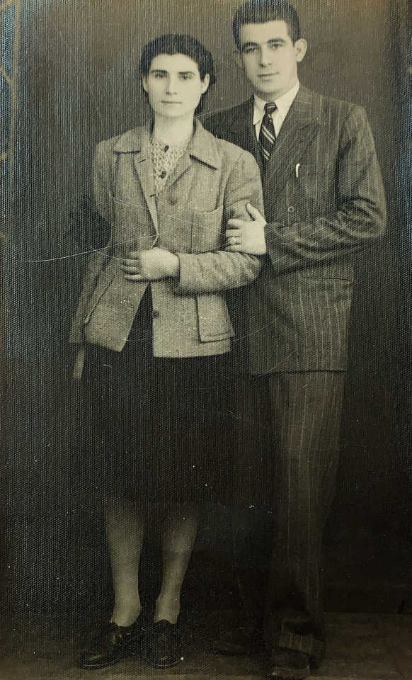
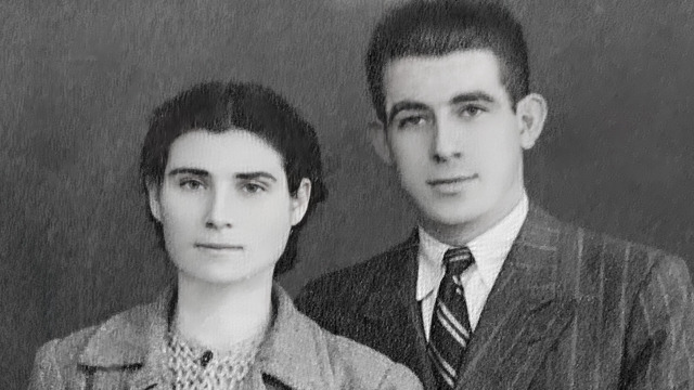
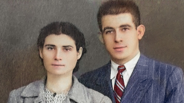
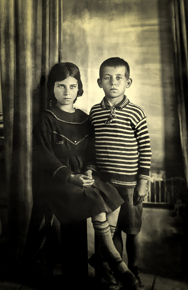
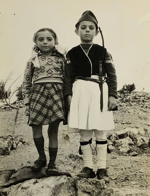
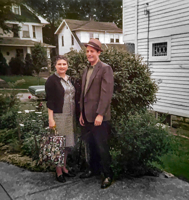
Next up we have these two very serious youngins who are now less young.

image

I loved the tone of this photo. Not quite sepia, not quite black and white. This is a really well done photo, even for modern times. The lighting is wonderful and I love the posing and environment. I would be proud to have taken this photo even today. The eyes are so beautiful and haunting.

This mostly needed clean up work. I had to fix some physical damage and I spent a long time with the remove tool getting rid of specks. You would not believe how much of restoration is just zapping specks. I had to convert it to black and white and then manually add that cool tone back but I’m pretty sure I got it to where it was without all of that… speckitude.

image

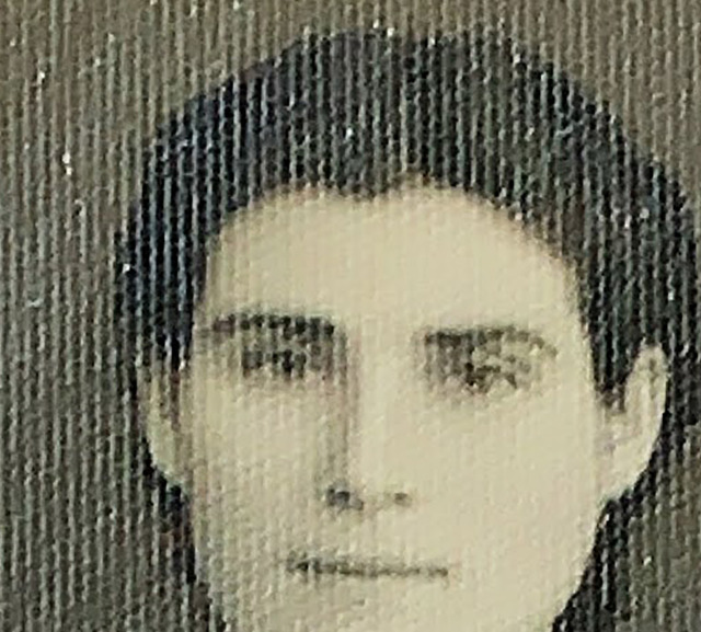
This is Katrina’s grandpa sporting a mustache he didn’t know would be regrettable later in life. For his sake, we’ll call it “The Chaplin.”

image

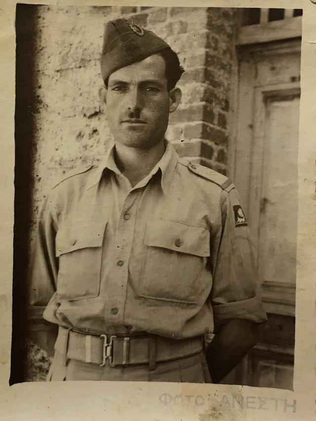
I wanted to preserve the look of this being a physical photograph with edges, so I didn’t crop. I kept the sepia-like tonality as well. But when I fixed the contrast and exposure, there was a very rough and uneven texture.

image

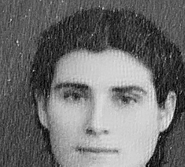
None of my normal techniques could eliminate this texture without sacrificing a lot of detail and blurring the image. Since the image was already soft, I was having trouble figuring out what to do.

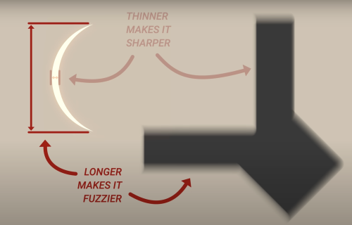
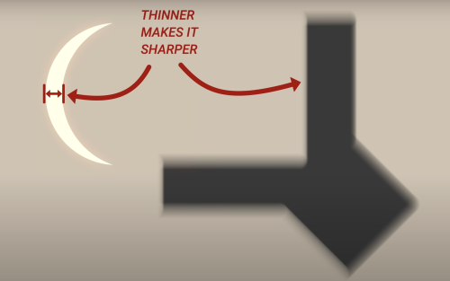
Then I thought about Imagenomic Portraiture, which is a high end skin retouching filter. While it can be used to obliterate pores and create unrealistically smooth skin, its actual intended use is to reduce detail caused by modern optics and high megapixel sensors.

While skin isn’t supposed to be featureless porcelain, we typically don’t notice one another’s vellus hairs and pores. But the immense detail caused by modern cameras can make pores look like canyons and vellus hairs look like beards. So you use skin smoothing techniques (sometimes called frequency separation) to turn down the volume on that detail just in the spots where the camera picked up on detail that our eyes typically wouldn’t see. And selectively removing detail was exactly what I needed.

So… what if I used that skin smoothing filter on the entire photograph instead of just the skin? Perhaps that would keep the desired detail and get rid of that nasty texture.

image

Much better, but now the photo looks a bit too… smooth.

Let’s add some grain to give it proper looking texture. It will look much more uniform than that ugliness from before.

image

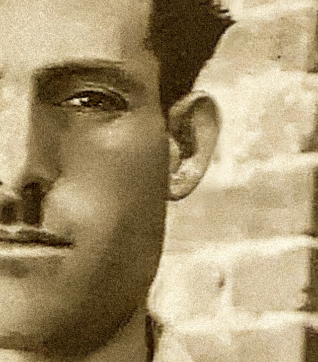
I think that looks about is good as it can. Let’s see the finished product.

image

Also, Katrina isn’t wild about her grandpa’s mustache. I guess she isn’t a fan of Charlie Chaplin or something. So I decided to fix that as well.

image

That is one handsome grandpa.

I’d also like to thank Imagenomic for helping me with this photo and several others with this same issue. Their filter is quite expensive and I couldn’t afford it. The deadline to finish these photos was coming quick and so I emailed them and asked if I could get the Black Friday discount despite missing the sale by a few days. I explained I was a disabled photographer and that I was working on a gift for my best friend’s parents who I was meeting for the first time. Ani, in customer service, asked if I could verify my disability. I thought maybe she was going to use that to convince her manager to give me the 30% discount.

I got a reply the very next day and it included a discount…

For 100% off.

It was like a proper Christmas miracle.

I legit cried.

I made sure to send her the finished before/after photos and thanked her for helping me with my gift.

image

Manfrotto could learn a thing or two from Imagenomic.

I don’t know how to thank Ani and Imagenomic, so I will give my honest review of their product to show my gratitude.

I truly believe Portraiture does nearly as good of a job at skin retouching in just a few seconds as manual retouching/frequency separation—which can take over an hour per photo. This isn’t some dinky Facetune app. You get professional results in just a few clicks. It is basically an accessibility tool for me due to how much energy it saves. It’s subtle but effective and as long as it is not abused, it creates beautiful natural realistically textured skin minus harsh detail. If you take high resolution photographs of people’s faces, I highly recommend it.

And it is also pretty great at removing gnarly texture from old photos too.

Thank you for being cool as heck, Imagenomic.

Next we have a photo of Katrina’s dad in a costume from a school play.

image

Apparently, Greek schools were fine handing out giant daggers to young children in those days.

This photo is actually in decent shape. All of the detail in the sky was lost though. It has a color cast and looks a bit underexposed.

image

This also looked like it might be a good candidate for colorization. Not every photo is and it can take some trial and error to figure out which photos are suitable for this process.

I’m afraid this is not a one click solution yet. Photoshop’s new neural filters are still a bit of a hot mess and colorize is no different. But if you can get past the quirky interface, it can do a lot of the heavy lifting.

And with a little cleanup, I am pretty happy with the results.

image

Funny story… I prepared a layered PSD of this color version. I thought it would be cool to correct the costume to the proper colors when I showed it to Katrina’s dad. I isolated the hat and the sleeves and could instantly turn them any color. It was going to be like a cool Photoshop magic trick right before his eyes.

image

When the time came, after being blown away by the restoration, I asked him what colors everything should be.

He sat and thought for a second.

“Hell, I don’t remember! Looks great how it is!”

So we stuck with blue. He was plenty impressed without my cool magic trick though.

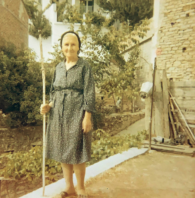
I can’t remember who this was, so I’ve just been calling her “old lady with a stick.”

image

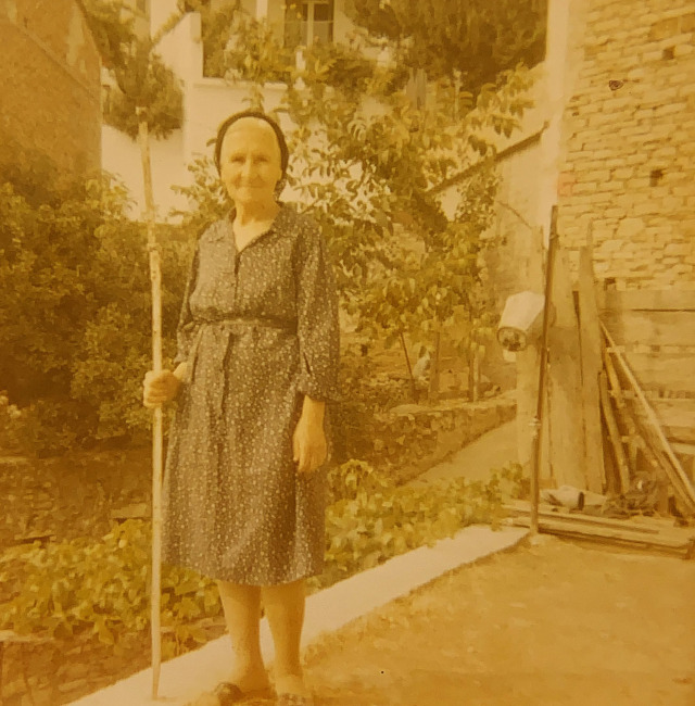
This photo was not just faded, it also had a very severe color cast. And once I removed all of the fading, it still felt like there was a layer of yellow on top of all the colors.

image

So, the opposite color of yellow is blue. Let’s open up the color balance tool and see if shifting yellow to blue helps.

image

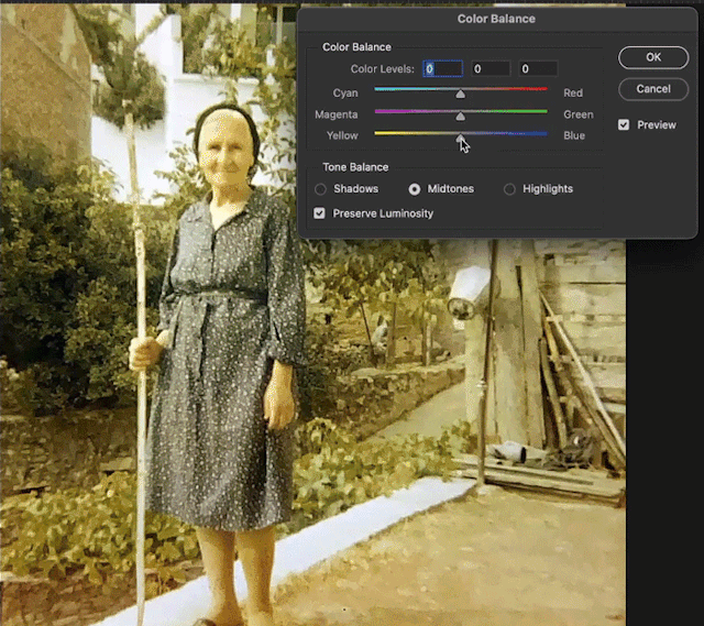
Looks like there is something to that “color science” stuff after all.

Repeat that with the shadows and highlights and then do the typical adjustments as with any photo and you end up with this.

image

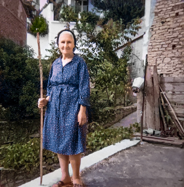
That’s a really good stick. I know several doggos who would be so jealous right now.

So, what do you do if the photo isn’t really in need of much but you still want to impress with the before and after?

image

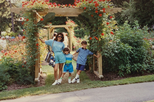
A good rule of thumb is to remove any distractions and make sure the subjects are the star of the photo. In this case, that road is bugging me. And I don’t care for all of those people in the background.

image

That is some rad 80s fashion. Though I’m pretty sure this is the 90s. Sometimes fashion takes a bit to saturate into a new decade I guess.

This photo was probably the most faded of the bunch.

image

But we know that is a simple fix with a levels adjustment of each color channel. However, this might be a good opportunity to show a super fast way to almost instantly remove this kind of fading. If you have an old photo that has turned red and you don’t feel like dialing it in manually, you can open up the curves tool and hit the options button.

image

Hit the “Enhance Per Channel Contrast” and it will automatically fix most of the fading. Not adjusting each channel manually can cause you to lose some detail in the brightest and darkest areas, but if you have a bunch of old photos to get through and “good enough” is good enough, you can create this as an action and fix fading at hyperspeed. With one click I was able to do this.

image

This is an acceptable result.

But if you take the time and care and do it the old fashioned way, you can get something more like this.

image

Requires more than one click, but I think it is worth it if you aren’t in a huge hurry.

This next photo confused me at first. I thought there was a lake behind them. And when I started to restore the photo something was bothering me about that damned lake.

image

It finally dawned on me they were actually in front of a giant waterfall. Niagara, to be exact. There was one spot in the waterfall that wasn’t completely blown out and I was able to bring back detail in that section of the waterfall.

image

And based on that tiny section, I was able to use that as a reference to rebuild the entire waterfall using various techniques. I did generative fill and cloning and dodging and burning and anything else I could think of.

And eventually, Niagara revealed itself.

image

This one might be my favorite of the bunch. When I really get to flex my artistic muscles and I get a decent result, you can’t beat that sense of accomplishment.

Katrina’s grandmother came for a visit.

image

Nothing too special with this one. Fixed the colors and added back in a sky. It seemed like it was near sunset, so I chose an orangy sunset sky.

image

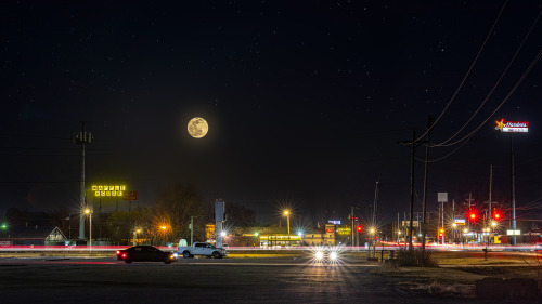
What I didn’t realize is the sky I added included mountains in the distance. And when Katrina saw this she asked why Boca Raton suddenly had a mountain range.

I was embarrassed for missing that detail, but she actually thought it was funny and insisted the mountains stay. Her parents both laughed and concurred.

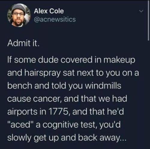
I couldn’t help but be reminded of this tweet…

image

And I couldn’t help myself…

image

I am become God, creator of Floridian mountains.

That is all the photos Tumblr will allow me to add to this post. But there are still a handful of cool restorations left.

So…

To Be Concluded in Part 3!

Photo Restoration Part 3: Dealing with Dongs

I think a major theme of Part 3 is going to be “direct flash is my arch nemesis” with a touch of “you can’t save every photo.”

Here we have a group shot taken with direct flash… my arch nemesis.

imageimage

The flash got nearly everyone but there was a drastic falloff of light for the girl on the left. Beyond that, everyone’s skin tones were wildly inconsistent because they were either closer or farther from the light source. And in these situations, you just have to dig in and and start fixing faces one by one.

With the new people selection tool, Lightroom will detect every single person in this photograph and let me adjust them individually. It can separate hair, face, lips, skin, and clothing. And if the photo is zoomed enough, you can even adjust the whites of the eyes and the iris individually.

image

That facial sunburn you see is Lightroom detecting her face and letting me adjust it in isolation.

—————————–

There is an expression “God is in the details.”

imageimage

Due to being a heathen, I’ve been meaning to find a new expression that means roughly the same thing. Let me workshop a few ideas right quick…

  • Micromanaging pixels delivers a superior cumulative result.
  • Your deity of choice resides in the numerous small adjustments that deliver a superior end product.
  • Obsessing over things people may not notice makes things more gooder.

I’m sure I’ll figure it out.

Basically it means if you do a bunch of tiny things they will add up to create a big overall effect.

So, you may not even notice the sunlight is bouncing off the green grass and turning all the metal on the swingset green. But when I take that reflected green light away from the metal it just makes a little more sense to the brain.

image

And you may not have noticed that the detail in the flower on Katrina’s head was completely gone, but your brain just feels a little more satisfied when it is restored.

Okay, how about this…

“Attention to detail makes the brain go tingle.”

It almost rhymes and everything!

Alright, fine. God can stay in the details.

—————————–

Sometimes the best thing you can do for a photo is make sure that people can see the thing. If there is a thing that really needs to be seen, you have to crank up whatever dials you have at your disposal to make it the star of the photo. And in this case, the star is Grandma’s giant hand-made doily…

imageimage

That’s a fine looking D.O.U.S. (Doily of Unusual Size).

All of that intricate detail is still in the photo. It’s just a bit lost and needs to be found. The clarity and texture sliders in Lightroom are great for enhancing small details without getting those crunchy artifacts sharpening filters can manifest.

—————————–

Distractions!

Avoiding distractions is probably one of the most important aspects of photography and photo editing. And in this photo we have a giant car sized distraction.

imageimage

With the car, this photo becomes dated. The make and model and year of that car give away a time period when everything else in the photo is almost timeless. So, removing the car seems like the best thing to do for this photo.

In the past, I probably would have employed a mixture of techniques to delete the car. Cloning, content aware fill, the patch tool—I would have found places in other spots of the photo that looked similar to that spot in the photo and just massaged it until it looked correct. A very tedious and time consuming process.

Or I would have cropped the photo if I was tired.

But with Adobe’s new generative fill, I can just circle the car and hit a button. And it does an incredible job of filling in that space with perfectly matched dirt and rocks and shrubbery.

Now the photo looks like it could have been taken in the 40s or 50s or 60s.

—————————–

My nemesis is back. Back with a vengeance.

imageimage

Direct flash, you are killing me.

Sometimes you have to accept that you cannot get the image to where you wish it could be and focus on what you can do to improve it. Identify the major issues and then problem solve how you can mitigate them.

The big issues in this photo…

  • Overexposed.
  • Skin tones are wildly varied due to distance from light.
  • Hard shadows that are very distracting.
  • Bright background causing poor subject separation.
  • That lady’s giant hair.

And a bonus issue that only lives in my mind…

The flash overpowered the light on the right hand side and it doesn’t look like it is turned on.

So, I reduced the overall exposure, evened out all of the skin tone issues one face at a time, reduced the background exposure, and I did my best to eliminate those distracting hard shadows.

Unfortunately, the woman on the left had dark hair that was mixing with the shadow and I had a very hard time differentiating what was hair and shadow.

image

I tried many different techniques to make her beautifully 80s large ball of hair look like it had a natural edge, but I just couldn’t make it work with the energy I had.

But did you see the light? LOOK AT THE LIGHT!

image

So, yeah… I couldn’t completely fix this photo, but I could make the light more light-y.

—————————–

Well, poop.

Direct flash.

Again.

imageimage

In this photo the main issue is loss of detail due to overexposure. The light in the windows and the light in the white clothing was too intense and blew out to pure white. In the past there wasn’t actually much that could be done about this. But with the magic of generative fill, this can be addressed.

Am I talking too much about generative fill? IT IS JUST SO HELPFUL, OKAY?

So I went around to each little patch of window and asked Photoshop to just fill it with general shrubbery. But I also went in on the dress and the flower crown and asked Photoshop to fill that in with a texture.

—————————–

Here we have a Greek castle or fort or… ancient structure.

imageimage

This one was fairly straightforward. But there was no sky detail at all and there was a haze toward the top of the castle. Lightroom has a relatively new slider called “dehaze” and I thought, “maybe I should try that.” And… it totally worked! Always happy when something does what it says on the tin.

Photoshop also has a newer feature that automatically inserts a new sky. And because everything needs to be monetized, if you want access to additional skies you have to buy a sky bundle. Before you know it they will be selling subscriptions to skies. Perhaps a sky-of-the-month club.

Thankfully the feature also lets you import your own skies, so one day I am going to sort through every interesting sky I have ever photographed to avoid all of this buy-a-sky malarky.

—————————–

Next up we have an adorable family outing that was tarnished by some lewd graffiti.

imageimage

There is always some dick drawing dicks to dick up your photographs.

Thankfully this is an easy job for content aware fill.

Did you think I was going to say generative fill? Because I am in love with generative fill and want to marry it?

Generative fill can take ~20 seconds to do its thing and I usually reserve it for more complicated tasks. Content aware fill is actually a very powerful way to remove simple things from photos and works nearly instantly.

Though I wonder if this tool was really “aware” of what it was covering up.

But then a little devil on my shoulder influenced me to go another way with this photo.

Photoshop can erase, but it can also… create!

image

Did you find all 6?

I originally meant to send this to Katrina as a prank. But I accidentally sent it to my Aunt Denise instead.

image

Thankfully my aunt is very cool and maybe a little oblivious to penis graffiti.

And then I had to tell Katrina that I sent the prank to my aunt instead of her.

image

And I’m pretty sure she is laughing *at* me and not *with* me, but as long as people are laughing I am happy.

Also, I think autocorrect changed bonafide from bonerfide and ruined Katrina’s amazing pun. Apple is just killing all of our jokes. 

—————————–

Distractions! Again!

imageimage

One of the core teachings in any beginner photography class is to minimize distractions and draw attention towards your subject. And I just felt this scene was very busy and drew attention away.

So, I deleted half of the people.

Am I… am I Thanos?

—————————–

Last photo!

image

This is probably the stereotypical image people think of when it comes to photo restoration. It has all of the classic photo trauma. Torn edges, a giant crease, washed out contrast.

We can rebuild it! We have the technology!

image

The only thing I couldn’t fix was that nobody had eyeballs. There were just blank voids where their eyes should be.

image

And I wondered to myself, “Perhaps A.I. has become advanced enough to restore these folks’ eyeballs.”

Ummmmm…

image

Errrrrrrr…

image

You know what… the voids were fine.

So, that is the end of this photo restoration journey. I hope you found this interesting. If you want to see all of the before and after photos, I made a Flickr gallery here. There is a small icon at the top of the page that looks like a computer monitor with a play button inside—that is the slideshow function which makes it very easy to flip back and forth.

And if you are in need of restoration services please feel free to send me a message. Just know that not every photo is a good candidate—though most photos can be improved to some degree.

This project represents months of work. Hours and hours of tutorials and trial and error and failing and restarting from scratch.

And then this post documenting the project represents months of work. Finding the energy to write all this while going through a very stressful time trying to keep my house has been difficult.

So, I have put a lot of work into this is what I’m saying. I can’t believe I finally finished. I was worried this would be something that just remained a draft forever.

Oh, and if you want to know how Katrina’s parents felt about the pictures…

image

Mission accomplished!

2 weeks ago

April 20, 2024
CommentsComments (View)  
text

sirfrogsworth:

Photographers all know about polarizing filters. They remove reflections off the surfaces of objects. We use them to see into water or windows that are obscured by those reflections. But anything with an even slightly glossy surface has a layer of reflection on top. So if you have a shiny green plant, it can remove the shiny and reveal a very saturated green underneath. Polarizers also remove a lot of scattered and reflected light from the sky. Which reveals a deep blue color you didn’t even know was there.

Here is a photo I took of my circular polarizer.

image

And the first thing I noticed when walking outside during the eclipse was the color of everything was more saturated, just like in that circle. Apparently, an eclipse significantly reduces polarized light and I got this creepy feeling because I was only ever used to seeing the world like that through the viewfinder of my camera.

The other thing I noticed was my outdoor lights. I leave them on all the time because I never remember to turn them on at night. And usually the sun will render them barely visible during the day. On a very sunny day they almost look like they are off.

image

But you can clearly see they are shining and even flaring the camera during the eclipse.

Our eyes adjust to lighting changes very well so it was hard to tell how much dimmer things were, but that is a good indication. I took this photo a few minutes ago and you can see how dim the lights appear after the moon has fucked off.

image

I did a calculation using the exposure settings between these two photos. The non-eclipse photo has 7 f-stops more light. That is 128 times or 12,700% more light.

A partial Pringle eclipse cut the sun’s light by 99.2% and somehow our eyes adjusted to make it seem like a normal sunny day (with weird ass saturated colors).

Additional Observations

So, I woke up about 4 minutes before the eclipse. I was very unprepared to photograph it in the normal quality you’d expect from a photographer. However, I did capture some interesting details that I thought I’d share beyond the lack of polarized light.

First up… the shadows.

image
image
image

The shadows were very sharp. In photography there is this concept of light going from a spectrum of hard to soft. Hard light has very high contrast and sharp shadows. Soft light is more flattering and diffused with softer shadows.

image

To get hard light and sharp shadows you need a small “point” light source. A point light can either be very small or it can be very far away or a combination thereof.

In the studio you could use a bare bulb flash to get a point source.

image

Or you can attach a modifier like a softbox to create a large light source. The bigger, the softer.

image

The sun is massive, but it is also super duper far away. So it ends up being the smallest point light source available. However, the atmosphere can scatter and diffuse that light, essentially “enlarging” the light source.

To get perfect hard light shadows you need to go to… the moon.

image

But the eclipse blocked out about 99% of the sun and it reduced the amount of scattered light. And it greatly reduced the size of the light source causing some very defined sharp shadows.

image

But not *all* of the shadow was sharp. My left shoulder is very defined but my right shoulder is a bit fuzzy.

You can see it on my fingers too.

image

Sharp on one side, soft on the other.

This is essentially because the sun has been split into two different light sources in two different directions.

In one direction you have a larger light source causing softer shadows.

image

And in the other direction you have a smaller light source causing sharper shadows.

image

In photography we have these strip softboxes that we usually place behind a subject to create an edge light.

image
image

Only a narrow, small band of light is hitting the body. If we were to use a strip box to light a face, it would be a small light source creating sharp shadows.

image

But one trick we can do is to turn the strip light horizontal.

image

Now the light source hitting the face is large as it wraps around the head.

image

So a long and narrow light source is essentially large and small simultaneously. And depending on the direction the light is coming from it is either hard or soft light.

Destin from Smarter Every Day explained this phenomenon briefly in his eclipse video.

I also think this large and small light source phenomenon affected my lens flares when I photographed the sun.

In this photo it literally looks like I’m getting starburst flares from two light sources.

image

And in this photo the flares have a sharp bright edge as well as a dimmer more diffused area.

image

Normally these starburst flares (caused by light leaking through the metal aperture blades in the lens) have more homogenous tines without that feathering effect.

image

And then I noticed a different kind of flare in my photos—with all the colors of the rainbow.

image

And each band of color matched the crescent shape of my partial eclipse.

image
image
image
image
image
image
image
image
image

Like a camera obscura, these flares were in reverse orientation to the crescent sun. And while I wasn’t able to get the sun in sharp focus, the purple section of the flare is very defined. I think that represents approximately how much of the sun was covered by the moon at my location—about 130 miles from totality.

I am a student of light. That is essentially what photography is. And I found this to be a fascinating lesson on how bonkers light can be. I was a little bummed I couldn’t road trip to southern Missouri to see totality, but I am grateful to still have a cool eclipse experience.

2 weeks ago

April 17, 2024
CommentsComments (View)  
text

sirfrogsworth:

sirfrogsworth:

Remember this joke?

image

Well, I am going to do something similar only with photography. This is a photo someone took for an Amazon review of their Clinique products.

image

Honestly, it is not a terrible photo. They did some staging. They have an interesting background. All of the labels are legible. It is properly exposed. This would be a perfectly acceptable product photo for an Etsy page.

I’ve been taking these advanced photography courses in preparation for whenever I am able to create a new studio in the house. And my teacher is a photography badass. I just watched a 6 hour class on how to recreate a professional Clinique ad. And at first glance it looks deceptively simple. It’s just some skin care products being splashed with a little water.

Which is why I wanted you to see an average person for reference.

This is what Karl Taylor came up with.

image

And I don’t think I’ve learned so much about photography in one tutorial before.

Product photography is just loads and loads of problem solving. You have to light the chrome caps with a gradient. Which requires giant diffusion scrims.

image

Those big white panels are literally only there for the two chrome caps.

You need a pure white background, but you can’t let light spill all over the studio, so you put up giant black light blockers.

image

And you have to add another light just for the orange bottle on the right.

image

Oh, and if you want the bottles to glow, well, you have to hide a silver reflector behind them.

image

But you still want the edges of the bottles to be darker so they have some contrast. So you add some black tape to the sides.

image

And in order for the reflective labels to have bold black lettering, you have to reflect black cards into them.

image

Ack! Karl’s beautiful bald head is showing up in the chrome caps! He must put on the naughty blanket.

image

And once you get every aspect of every bottle perfectly lit, you finally get to yeet some water at it all.

image

I don’t love product photography because I have a weird obsession to help greedy corporations make their wares look more beautiful. I love it because it is a complicated and challenging new puzzle every time. Every product is a different shape and requires a different technique to make it look its best.

I don’t know if I will be able to live up to Karl’s standards.

image
image
image
image
image
image
image

This is about the level I was at in 2017 before I quit photography.

image
image
image
image
image

I have so much more knowledge in my brain now. I’m really hoping I can surpass that.

A few people mentioned they thought those product images were created in photoshop and not actually photographed. CG renders are becoming a bigger aspect of commercial advertising. It can be more versatile. There are a lot more CG artists than high end product photographers. It’s cheaper. A lot of car advertising uses CG.

However, there are some big brands that insist on the real thing. Apple, Clinique, and Rolex, for instance. And there are things that CG is not as good at representing. Organic shapes and textures can be hard to represent photorealistically. So food, clothing, and anything that requires a human in the picture still need photography.

And I’d like to think there is an ineffable aspect photography can sometimes deliver that CG tends to struggle with. In the end, it is usually up to the art direction on whether an image is successful.

Karl actually did a comparison of his photography against CG. Feel free to guess which image is a render and which was photographed. I’m curious to know if you can spot the difference.

Fancy Watch.

1.

image

2.

image

Orange Cologne.

3.

image

4.

image

Blue Cologne.

5.

image

6.

image

Apple Watches.

7.

image

8.

image

Answers below the cut.

Keep reading

This has been generating a lot of interest so I thought I’d post it here as well.

If you are interested in photography and are a beginner, I recommend this free online course.

And if you are at an intermediate to advanced level and want to learn how to sculpt artificial light using flash or strobes, I highly recommend Karl Taylor’s Visual Education platform. Yes, there is a monthly fee, but there are nearly 1000 classes spanning all genres. I think it would surpass just about any university level photography education. Karl personally replies to every comment on the platform and answers any questions you may have.

And once I get my home studio up and running in a few months I plan to restart my own photography education over on my @frogmanslightschool Tumblr.

I’m going to be focusing on photography for non-photographers.

How to use your smartphone or a cheap DSLR to get decent photos of important life events without having to learn every aspect of photography. I want to develop simple recipes for common situations like celebrations, ceremonies, pets, kids, sports, etc. Feel free to follow me there and ask any photography related questions you have. Just know the educational content won’t start for a while.

2 weeks ago

April 16, 2024
CommentsComments (View)  
text

sirfrogsworth:

image

Corgi comfort could be researched for centuries and still baffle scientists.

3 weeks ago

April 14, 2024
CommentsComments (View)  
text

sirfrogsworth:

image

I am really getting tired of this FAKE NEWS.

Trump DID NOT say windmills cause cancer.

If we are going to disparage this bloviating buffoon, we need to do it accurately.

He clearly stated the *noise* from windmills causes cancer.

Don’t let this man get away with being less ridiculous than he actually is.

Noise cancer is orders of magnitude more stupid.

That would mean we could record windmill noises and then weaponize cancer by holding a boombox over our heads.

image

People are assuming they already know what is in the above video and are skipping it.

I’m just saying that might be an erroneous assumption.

3 weeks ago

April 11, 2024
CommentsComments (View)  
text

sirfrogsworth:

image

Moon Over Waffle House

When I went to take pictures I thought to myself, “I don’t think I’ll need my other lens.”

And I didn’t.

Until I was driving and right in front of me I saw this giant full moon directly above a Waffle House. And I just thought there was something majestic about that so I pulled into an empty parking lot to capture it. But then my lens was not nearly long enough to get the composition I wanted. But, using my motto “get the data you need” I took four pictures and smooshed them together.

So, I ended up getting the shot I envisioned in my head, but I’m definitely not going to leave my other lens at home next time.

Also, the stars are fake. The stars will always be fake. St. Louis has some of the worst light pollution in the country and I would have to drive 2 hours to hecking Mark Twain Forest if I ever want to see stars again.

I feel like I’ve been one-up’d.

image

No way I can compete with that. But I commend this photographer for a great shot.

Nick Martino [ Instagram ]
h/t: @tramtheram (thank you for finding the source!)

3 weeks ago

April 11, 2024
CommentsComments (View)  
text

hueypshootin:

sirfrogsworth:

image
image
image
image
image

He chose the one physical characteristic I am consistently complimented on.

I am… baffled.

Don’t nobody compliment this nigga hairline. They both goofy looking

image

I don’t see it.

3 weeks ago

April 11, 2024
CommentsComments (View)